CASE STUDY . 03 . MAKING THE CASE FOR DESIGN
SAP heavy enterprise. Engineering excellence. UX deserved its own seat.
The case for in-house UX wasn't made in a single proposal. It was made through three product arcs over seven years.
A decade writing SAP code. Then seven years building the case for internal UX, one project at a time. iCON, THE LIINK, and THE HUB each earned a little more of the seat the function deserved.
ROLE
UX Design Lead
COMPANY
Lennox International Inc.
YEAR
2012- 2019
SPONSOR
CTO - Chief Technology Officer

WHAT I WALKED IN PROPOSING
The CTO supported the tech team's model. I had to earn the case for internal UX, one project at a time.
I proposed an internal UX function. The CTO's answer wasn't yes, but it wasn't a no either. He asked me to work inside the existing model first. Only later did he share why, the external UX partnership had been working for the tech teams, and he wanted me to see that from the inside before recommending a different direction.
That was the first lesson in design leadership at this layer. The right answer isn't always available on day one. The case would have to be earned through the work, one project at a time.
ICON: WHERE CO-CREATION MADE THE CASE
Four stakeholder groups. One reimagined service. Customers voted for the direction.
iCON was the first project. I joined the co-creation workshops as a participant alongside customers, engineers, controls teams, and IT. The design sessions were where "inside the existing model" work happened.
Across multiple sessions, the design directions that customers voted forward were consistently the ones I had brought into the room. The service reframed itself into three connected views: multi-site view for proactive monitoring, a single-site view for service coordination, and an equipment view for failure response. iCON won the Pacesetter Innovation Award.
THE LIINK: WHEN THE BRIEF TURNED OUT TO BE WRONG
Started as an intranet redesign. Became a story about engagement, recognition, and growth.
THE LIINK started as an intranet redesign. When I went to assemble Content Creators from each team, almost nobody volunteered. The frustration wasn't with the intranet. It was with the experience of working there, no recognition, no career growth, no reason to invest extra effort.
I synthesized the IT 360 review results with HR, redefined the problem as engagement, recognition, and growth, and led research across IT, business, corporate, and engineering teams. THE LIINK shipped as the common platform for all Lennox employees. It improved internal productivity by 50% and won the Pacesetter Productivity Award.
THEN THE REORG. THEN THE HUB.
A new business unit. A new domain. A team that wanted screens by Friday.
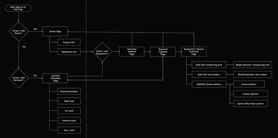
The reorg split the IT team across the business units. I joined the Worldwide Refrigeration team and stepped into THE HUB as the UX lead. I was learning the refrigeration business, learning how to operationalize UX inside the team's Agile cadence, and learning the engineering systems behind the platform. All at the same time.
The Project Manager wanted screens drawn in days. He hadn't worked with a UX practice before and didn't see the work as anything more than visual design. The work needed someone willing to slow down enough to learn it properly first.
WHO ARE WE DESIGNING THE HUB FOR
Lisa, John, and Deb each had a different problem. The platform had to serve all three.
The service design lens framed THE HUB around three core users.
Lisa, a new contractor
Couldn't go past the first screen of the box load calculator without learning brands.
John, Manufacturer's rep
Couldn't use his product knowledge to select items and move quickly.
Deb, Heatcraft employee
Drowning in customer calls because the application was too slow.
One platform had to deliver three different experiences without becoming three different products. I anchored the team on three design principles: clarity, empowerment, efficiency. They became the shorthand the team used to evaluate options across hundreds of micro-decisions.
THE DESIGN PRINCIPLE THAT RAN UNDERNEATH
Complex systems behind. Seamless experience in front. Design did the connecting.
THE HUB ran on three systems: SAP Hybris for e-commerce. CPQ for equipment configuration and pricing. SAP ERP for operations. Each had its own logic, its own data model, its own limits on what was feasible.
The customer needed to size a refrigeration system, configure it, price it, and order it, without ever worrying about platforms underneath. Making that work meant learning the engineering side of each system deeply enough to design with the constraints, not against them. The work of design here was understanding the technical constraints and creating a seamless experience for the customers.
SAP CPQ
SAP Hybris
WHEN THE DEVELOPERS SAID NO
I attended the CPQ training. Then "can't be built" had to come with a reason.
The CPQ developers kept rejecting my designs initially as "can't be built." After a few rejections, I attended the CPQ training classes. Sat through the technical sessions. Learned what the platform could actually do. After that, the conversations got more specific. When a design got pushed back as infeasible, I could ask the specific question that surfaced whether the answer was a real constraint.
EARNING THE TEAM'S TRUST
Trust before screens. A transparent process. UX inside the Agile rhythm.
I didn't argue with the timeline. I started the research work. Stakeholder interviews with sales, marketing, modeling, and material management to understand the existing markets. SME interviews with refrigeration engineers to build a basic understanding of condensing units, unit coolers, and complex configurations with system options. By the time I came back with the first round of research, the team's question had shifted from " where are the screens? " to" what did you find? ".
The trust came from what the team could see. I built it through a transparent design process and by delivering the screens they needed on time. The research, design, and testing work ran inside the team's Agile cadence, on the same Jira board, on the same sprint rhythm. There was no UX black box. Everything I was doing was visible.
UX became a clarifying force for the delivery team. The Dev and QA teams started to request the screens earlier in each sprint because the requirements were complex enough that the visuals helped them understand what they were building.

THE IMPACT
Three products. Three awards. A design practice that had earned its seat.
48%
increase in customer registrations for the THE HUB
50%
improvement in internal productivity from THE LIINK
27%
faster task completion for application engineers
30%
reduction in post launch bugs
3
Pacesetter Awards:
-
iCON Innovation
-
THE LIINK Productivity
-
THE HUB Innovation
The case was made. iCON proved the value of service design. THE LIINK proved the reach across the employee experience. THE HUB proved the depth across SAP ERP, Hybris, and CPQ. Together, they planted the conditions for UX to grow at Lennox.
THE REFLECTION
Seven years taught me where design's real territory lives at this scale. Not the screen. The service, the system, and the seams between systems.
Writing code taught me the systems. Designing services taught me to see the connections. Leading the case for change taught me why design leadership matters.